What Airports Looked Like in the 1970s
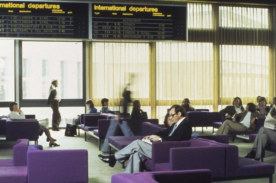
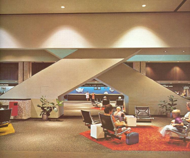
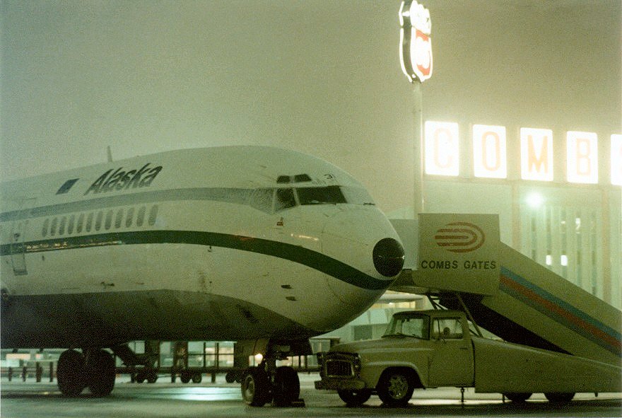
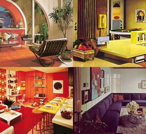
I have always felt that there is something cosy and homey about the color schemes of the 1970s. Dark and powerful earth colors dominated the design of the corporate, home and commercial western world. From shopping malls, to the basement den to the airport. So, follow us as we visit some airports of the period to experience what checking in was like in the 1970s.
American author Tom Wolfe labeled the 1970s as “the Me Decade”. He based this on America’s newfound preoccupation with self-discovery and self-awareness. So the design, colors and atmosphere reflected these values of course. Bright green, brown, orange, red and yellow colors ruled everything from appliances, carpets, wallpaper and sofas. Commercial buildings such as shopping malls and airports prominently featured the new “me decade”. You were meant to feel like you were still at home, all the time.
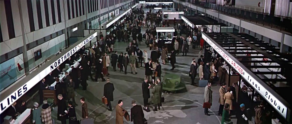
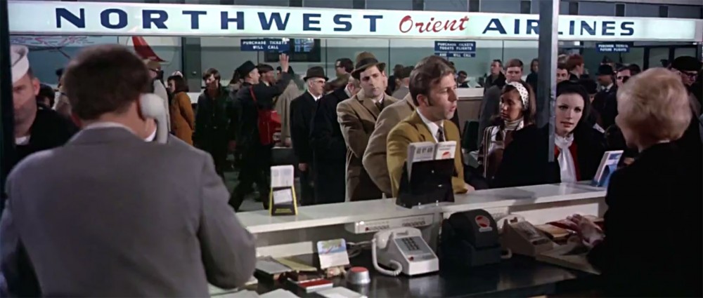
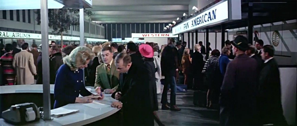
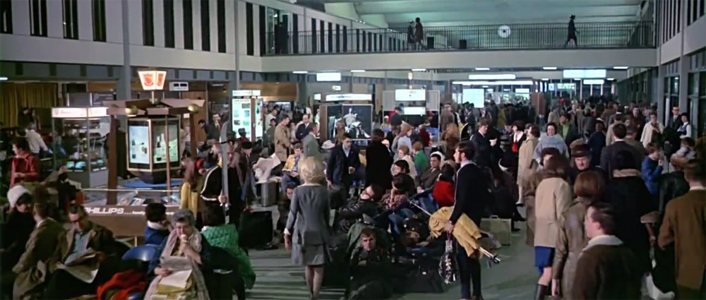
Below are bunch of photos, screenshots and postcards from Minneapolis-St Paul, Stapleton, Melbourne, Berlin and Tampa airports from the 1970s. All of the movie buffs out there will surely recognize Minneapolis-St Paul as the stand-in location for the fictional “Lincoln International Airport“, from the movie Airport (1970).
What are your favorite memories of the 1970s design?
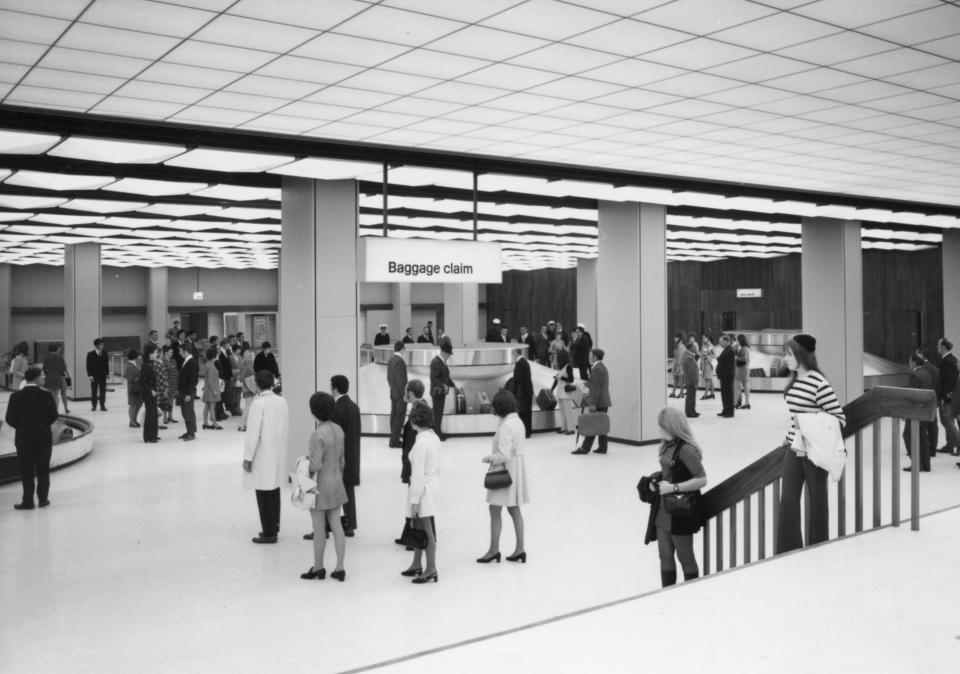
Above: Melbourne Airport Arrivals hall in the 1970s
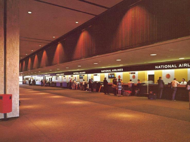
Above: The check-in area at Tampa Airport in the 1970s
Above: The check-in area at Tampa Airport in the 1970s
Above: Berlin Tegel airport in the 1970s
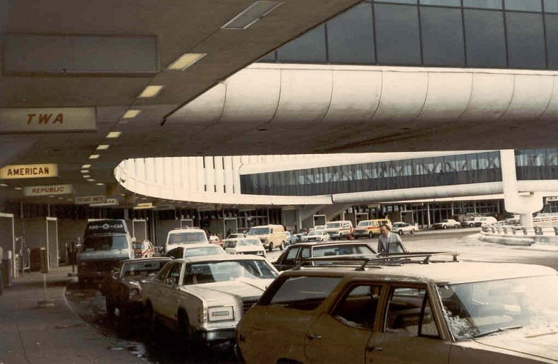
Above: The departure area of Stapleton Airport
Above: The interior of Stapleton Airport
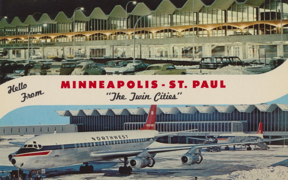
Above: Minneapolis-St Paul Airport as it looked in the 1970s
Above: Overview of the checkin area of Minneapolis-St Paul Airport
Above: Will that be smoking or non-smoking, Sir?
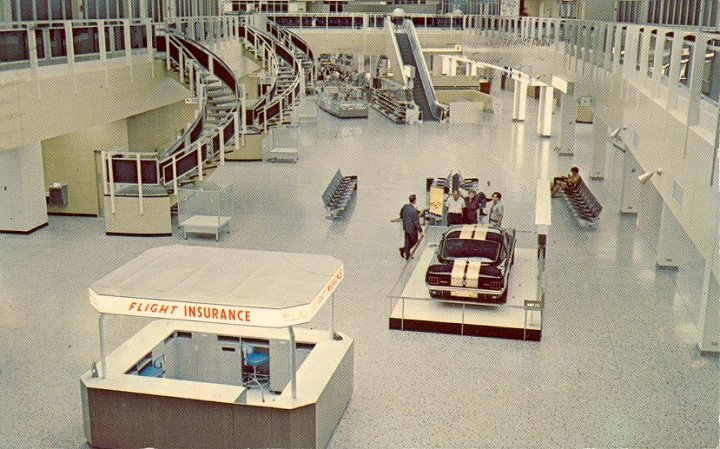
Above: Better get that life insurance
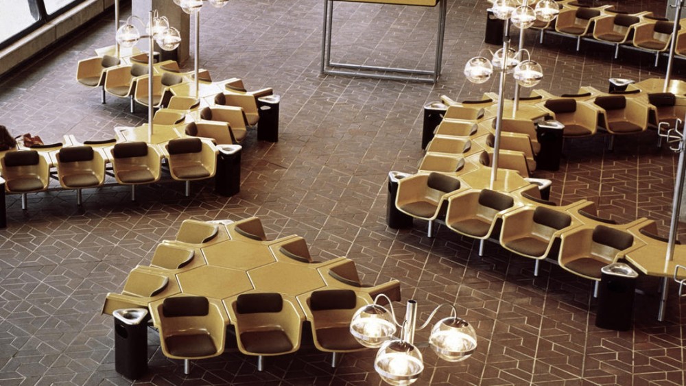
Above: The departure lounge at Minneapolis-St Paul Airport
Above: Stapleton Airport in Denver


